Kenosha Parks: A Spatial Analysis
- Maxwell Seebeck

- Apr 12, 2019
- 4 min read
A research based project with the objective to analyze the spatial distribution and access to public green spaces, and schools in Kenosha, WI


Objective
Across the United States green space is unevenly distributed between social classes of race, age, gender, and income (Wolch, et.al, 2014). These distributions usually benefit white, and affluent neighborhoods; leaving inner city, lower income neighborhoods with less access and a higher population density per green space. I will be running analyses that measure access and show the distribution of parks in Kenosha county, to answer if the spatial distribution and accessibility of public parks, libraries, schools (green spaces) in Kenosha allows equal access for all residents.
Lit Review
Access to green, open spaces can provide a wide spectrum of ailments for the mental and physical health for urban residents, as well as promoting ecosystem services and community interaction. Parks, sporting fields, riparian areas, greenways, trails, community gardens, green walls, green alleyways and even backyards, are all considered green space, but these spaces are rarely disturbed equally within the urban setting. This distribution has caused health concerns in effected communities, that have shown higher mental disorders, diabetes, obesity, and heart dieses rates (Bedimo-Rung, et.al, 2005). Geovisualization of spatial inequality has become an essential tool in spatial justice and can be used to accurately define areas that lack services or facilities (Talen, 2011).
Finding the distribution of green space is quite easy, Tu Dam Ngoc Le in her report on “Accessing Walking Accessibility to Public Parks in the City of Buffalo” used Kernel density to show clusters of parks, and Euclidian distance to show service area buffers. These are well practiced methods to geovisualize the distribution of parks, but the results can be misleading due to the complex nature of the urban environment. Meaning parks can be spatially equal across the city but access can still be skewed. To show access, the use of a network analysis is required to assign values to green spaces by size and applying a reasonable walking time in correlation to park size (Le, 2001). This analysis will show who can walk within 15 minutes to a large park, 10 minutes to a medium park, and 5 minutes to a small park (Byrne & Sipe, 2010). This will calculate buffers by using a road shapefile to determine routes to a park and how long it will take. This will produce a buffer style overlay, which can be used to calculate total area of accessibility vs less accessibility. There is still error in this method as assumptions are made about the entrance to the park, and by calculating distance from the middle of a polygon. Both issues skew the results to either side. While the absence of a specified entrance may not affect all spaces, the ones they do affect will overestimate who has access by assuming some parcels are closer than they really are. On the other side, if you calculate distance from a center point, the size of the park with greatly impact the walking time to “reach” the park, this will underestimate how many people have access by the time it takes to reach the center of a larger park. Although Network Analysis has side effects, it is an extremely powerful tool to geovisualize access in the urban setting and can be used in determining spatial equality
Data Sources
Location: City of Kenosha boundary
Park/library/school map (shapefile): Kenosha Digital Mapping Department gis@co.kenosha.wi.us
Street map (shapefile): US Census/ Parkside Database https://factfinder.census.gov/faces/nav/jsf/pages/index.xhtml
Kenosha Population data (block group): US Census https://factfinder.census.gov/faces/nav/jsf/pages/index.xhtml
Kenosha Housing Total Count (block group): US Census
Data Analysis
With the data I collected I was only able to represent part of the spatial distribution methods as described by Tu in her study of access in Buffalo, NY. My processing was very straightforward after creating a polygon to clip every data set to. Most of my data analysis was simple overlay operations over a base map of streets, housing parcels with population data, and points of parks. Every layer is clipped to the study area (Kenosha boundary), while the housing parcels will need to be joined with population data and then clipped to the study area. The park shapefile will also need to be clipped and converted into point features. After the base map I set a multiple buffer of ¼ , ½, ¾ and 1 mile around all parks. I also used the points to create Kernel density maps to assist in the geovisualization of green space distribution.
Results
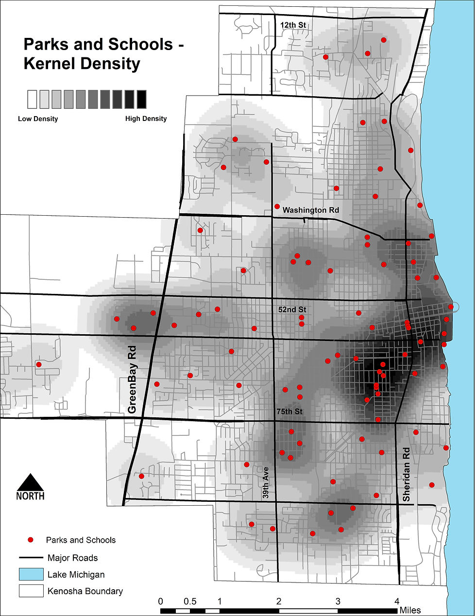
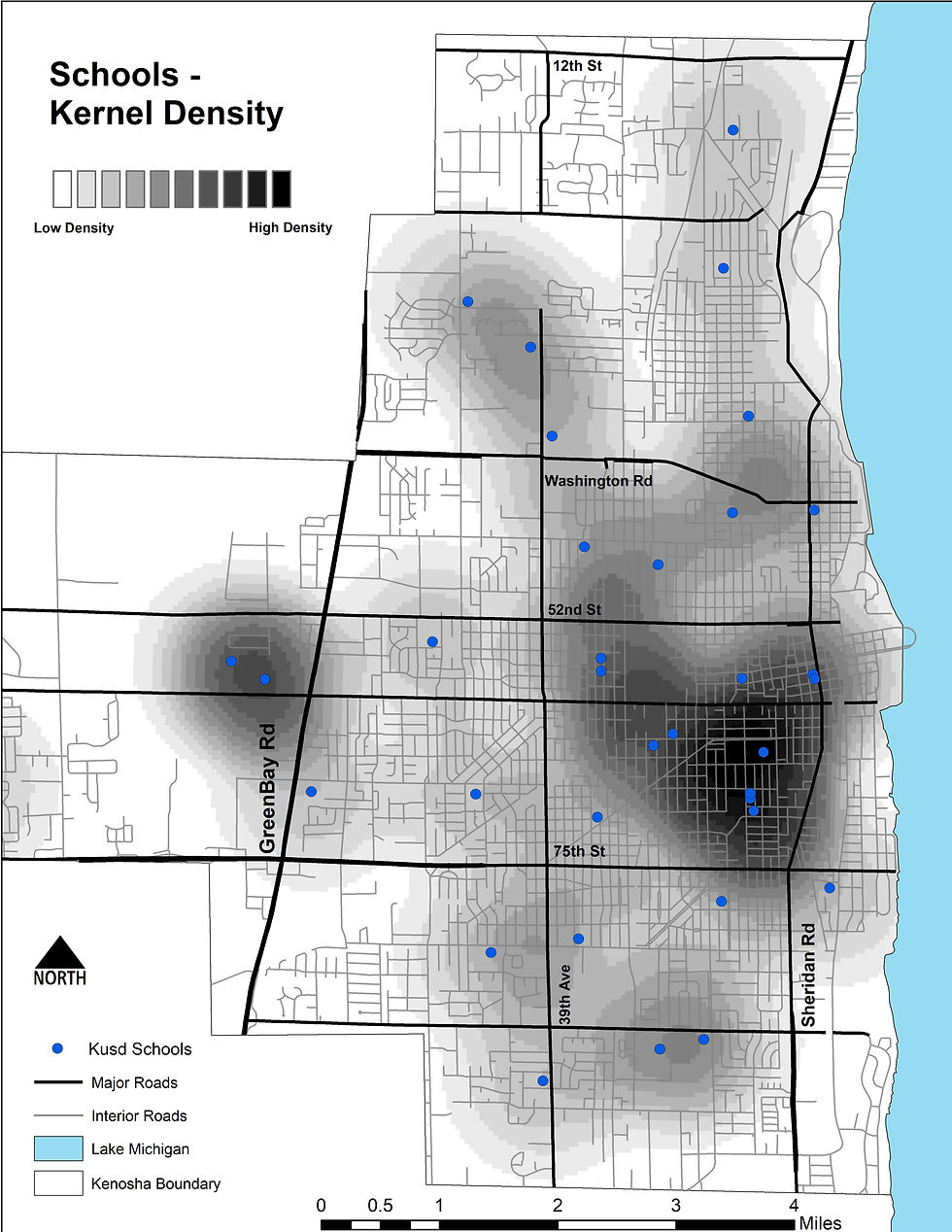
Despite this map being very out of date, I feel it gives a half way decent visualization of the distribution school, parks and open spaces in the city of Kenosha. I split the parks and schools into two different maps, with a third being a combined overlay. I thought about putting the population data under the kernel density and buffer maps but then I would have at least 6 more maps.
The distribution of parks and schools in Kenosha appears to be fairly equal across the city, but some neighborhoods do have a much higher density than others. The Kernels maps do well in highlighting this distribution.
This was my first serious overlay project and my output folder is full of clips, trims, buffers, and kernel rasters that did not make the cut. After struggling through some workflow issues, projection issues, and raster data output extents, I was able to partly complete was I set out to do
Comments